Overview
A redesign focused on improving UI of existing features, URL structure, site navigation, and placement of the Newsletters page within users account center.
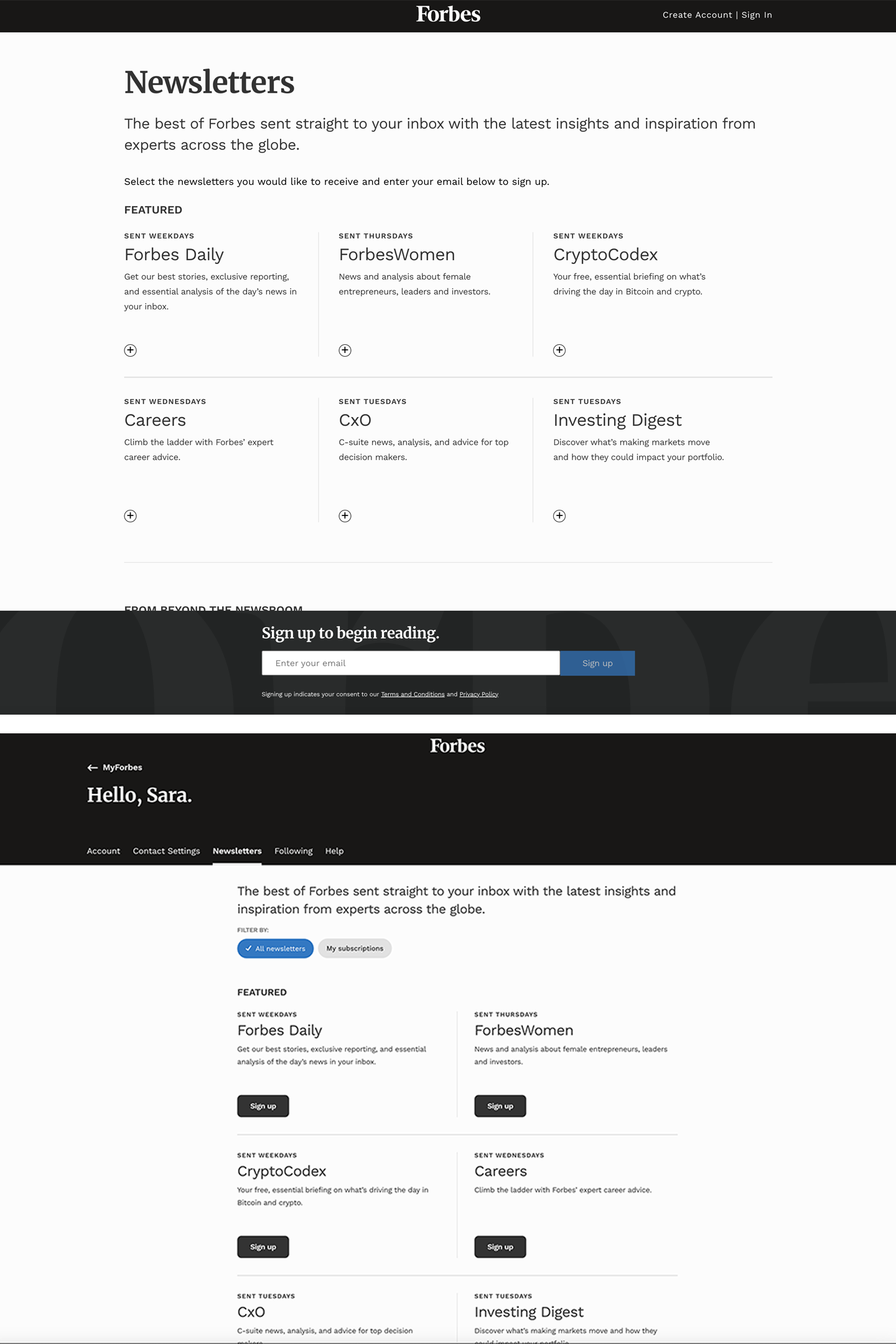
Problem
The structure of the newsletter lander page failed the user. There were two experiences based on whether or not you were signed in or out (see photo below). The premium newsletters that Forbes offers were completely missing from the lander page, which is a missed opportunity. The page was missing filters and organized in a way that made it difficult to discover newsletters of interest.
Design Process
The Forbes onboarding flow for a newsletter subscription felt weird and disconnected from the user's experience on the site otherwise. We were using a "cart" style flow to allow users to essentially add the newsletters they want and sign up all at once. But that wasn't clear in the original designs. The "cart" was anchored to the bottom, there was no indication as to what or how many newsletters were being added.
I took a look at competitors and other websites that have newsletter signups to get an idea of what is common for the user and what isn't.
Competitive Analysis
With that information, the design team got together to put together a list of pain points, nice to haves and likes/dislikes of other sites.